With the transition to Nike as the official apparel and jersey provider for the NBA for the 2017-18 season, teams have been unveiling their new Nike uniforms the past few weeks. Most have made minor adjustments, some have virtually changed nothing and others have used the opportunity to completely change their design.
Now that most of the NBA has done an unveiling, I am going to give some analysis of what teams have improved their uniforms for the 2017-18 season and which have maybe gone a little too far.
Here are your 2017-18 NBA jersey hits and misses…
Hit: Charlotte Hornets
[tweet https://twitter.com/Jumpman23/status/892062565563457536]
These jerseys are virtually the exact same except for one notable change: they now have a Jordan logo. Seeing the Jordan logo instantly makes them jerseys better.
Miss: Washington Wizards
[tweet https://twitter.com/WashWizards/status/893145715786100736]
The Wizards may have the worst jerseys in the NBA, the red, white and blue striped road uniforms are clunky and an eye sore to say the least. This was an opportunity to update their style and they opted for essentially the same design for 2017-18. Another team adopted this unfortunate style in the last few weeks.
Hit: Philadelphia 76ers
[tweet https://twitter.com/darrenrovell/status/892331576067018754]
The 76ers unveiled a beautiful new jersey scheme last season, maximizing the beauty of red, white and blue intertwined on a uniform and instead of changing course they managed to make them even better with a very sleek and visually appealing touch with the added red outline to the team name, player names and numbers. It has a 70s or 80s feel that harkens back to the organization’s golden age.
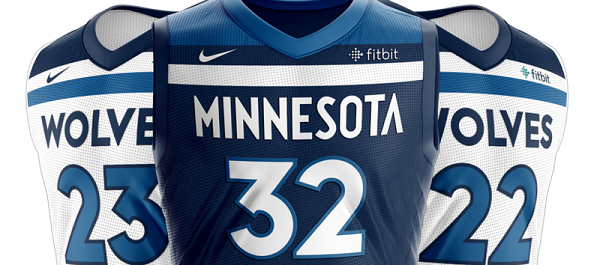
Miss: Minnesota Timberwolves
[tweet https://twitter.com/darrenrovell/status/895665920617709568]
While I will admit I wasn’t the biggest fan of the latest iteration of the T’Wolves uniforms (the tree embroidered versions from the KG era were beautiful though), these uniforms are a huge risk and creative, but they fall flat in my opinion. They are similar to the design of the terrible Wizards uniforms and resemble more of an AAA or international soccer team uniform than an NBA jersey.
Hit: Indiana Pacers
[tweet https://twitter.com/Pacers/status/891075595190366209]
It took me some time to fall in love with these and the road uniform looks a little college looking, but the Pacers took a much needed risk and it worked for me. The circular text has grown on me and works for the history of Indiana basketball. The slash design going down the side is beautiful and adds much needed flair to the Pacers uniform. I especially am a fan of the Association white edition.
Miss: Phoenix Suns
[tweet https://twitter.com/Suns/status/895795115976925184]
The Phoenix Suns have seemingly been undergoing a constant search for an identity on the court with their look and designs since the Steve Nash era ended. They have decided to mix it up and take another big chance here. The text is far too large and clunky on the white uniform and the lack of a color outline to the team name or color makes the jersey feel lower quality. The design on the shorts is way too loud and doesn’t work. Can we please have a simple and sleek uniform with the sunburst on the shorts?
Hit: Utah Jazz
[tweet https://twitter.com/RealGM/status/895319899861536768]
The Jazz already had one of the most beautiful and elegant uniforms in the NBA that intertwined classic and new-age with a great color scheme coming into this season and they smartly didn’t adjust too much other than turn up the yellow outline accents which serve as a beautiful contrast with the navy uniform and green accents.
Miss: Denver Nuggets
[tweet https://twitter.com/UniWatch/status/895070127753805824]
The Nuggets are another team that underwent a style change or update in the last few years, and decided to mix it up again with the nike jerseys this off-season. The powder or baby blue always pops and stands out in uniforms and is complimented well with the yellow and black accents of the Nuggets surrounding the jersey with. Deciding to phase that out in favor of the navy blue that many other teams have is a definite step back.
Hit: Memphis Grizzlies
[tweet https://twitter.com/UniWatch/status/895807383087271936]
I have been a fan of the Grizzlies uniforms for years (especially the light blue version of course), and the Grizzlies used this opportunity to make a great jersey even better by making it more sleek and simple with the removal of the yellow collar with the bear logo and turning up the light blue accents in a tasteful way. This uniform is very clean.
Miss: Cleveland Cavaliers
[tweet https://twitter.com/cavs/status/894630488085860352]
I was never a fan of the normal home and away uniforms the Cavaliers have had in LeBron’s second stint with the team (I loved the style in his first stint) but these aren’t really an improvement. They look a little too much like the cheaper Wal-Mart version of a team jersey and the Goodyear logo is too large and distracting. A lot of the Nike jerseys feel generic and these are one of them.