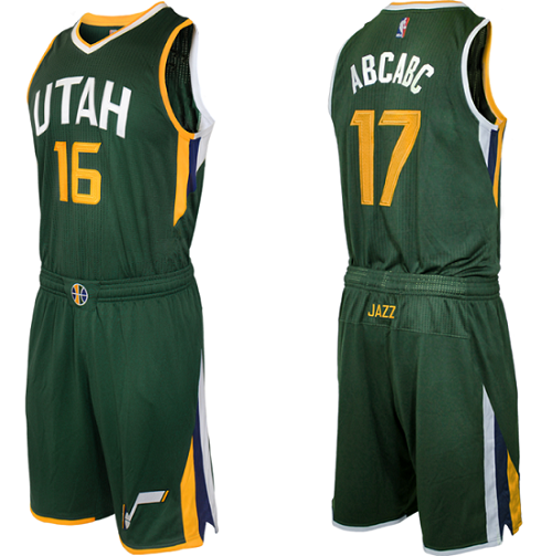
Add the Utah Jazz to the short list of NBA teams undergoing a slight re-branding this offseason. The Jazz unveiled a slight update and tweak to their previous logo set and uniforms and added a new sleeved jersey that is much different than any jersey they have previously had.
Here is the updated set of Utah Jazz uniforms for 2016-17:
Presenting our refreshed brand identity for 2016-17: https://t.co/AuTOcJvUjw
New uniforms, court & logo system! ??? pic.twitter.com/obs5YXwTjw
— Utah Jazz (@utahjazz) May 12, 2016
As you can see the home and road uniforms aren’t much different than what they have been wearing the past few years, there is just a slightly different collar and general jersey design with a greater emphasis on the color yellow.
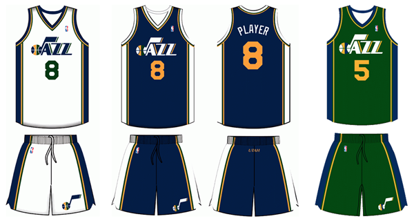
The bigger difference lies with the decision to change the alternate uniform to have “Utah” instead of “Jazz” with the jazz logo across the chest, which is a downgrade in my opinion as the previous version of the uniform was one of the most aesthetically pleasing in my view.
The big change is the sleeved alternate which is an absolute mess.
A modern take on a classic look. pic.twitter.com/tkrphoOwpZ
— Utah Jazz (@utahjazz) May 12, 2016
It looks like the kit for a random country’s Olympic soccer team, some weird, cheap knock-off or something straight out of the 70s. Maybe it will look better on the court, but in photos it looks awful.
The Jazz have unveiled a few new logos and a new court design as well.
The new Utah Jazz logo system – https://t.co/AuTOcJvUjw
??? pic.twitter.com/7Cm2T5SHae
— Utah Jazz (@utahjazz) May 12, 2016
Our new Larry H. Miller Court at @vivintarena – https://t.co/AuTOcJvUjw
??? pic.twitter.com/Kq3ST3tb0c
— Utah Jazz (@utahjazz) May 12, 2016
I will admit the court gets high marks from me as the yellow text on the baseline really pops with the navy paint and the Jazz symbol logos on either side are a nice touch. The mid-court logo is simple but effective and integrates the color scheme of the team effectively.
Let’s see if these new duds with get the Jazz back to the postseason in 2017.