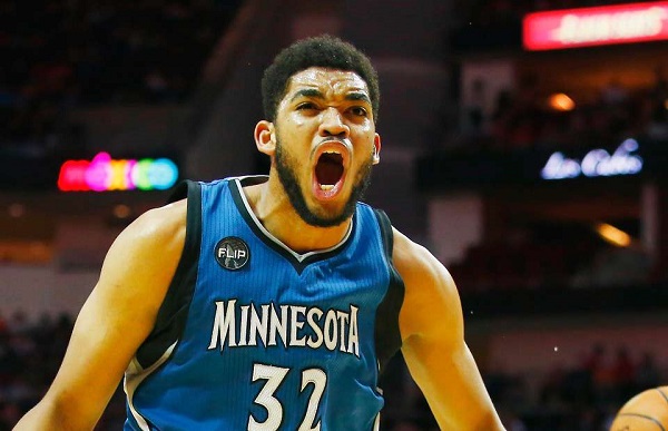
With the transition to Nike being the provider of all NBA jerseys and corporate logo patches being added for the first time, there are a slew of new or slightly updated jerseys that teams around the NBA are unveiling this off-season.
Quite possibly the first team to start hyping up their new logo, court design, jerseys and general look for the 2017-18 season were the Minnesota Timberwolves who tweeted this out from their official Twitter account in April:
Welcome to the New Era. #NewEraNewLook https://t.co/STDKfWVMrJ
— Minnesota Timberwolves (@Timberwolves) April 12, 2017
Despite the new logo, they are still yet to unveil their new jerseys for the 2017-18 season, or have they?…
https://twitter.com/TimmyJ7/status/895044227004080130
This is a screenshot that leaked from NBA 2K18 on Tuesday that clearly shows Karl Anthony Towns rocking a far different look.
Here is another tweet that shows the potential design for the road uniforms which is even more out there and far different than the Wolves have ever had…
I'm starting to believe these are the @Timberwolves new jerseys. Im a little disappointed in the design. @DWolfsonKSTP pic.twitter.com/0eapGtnbCi
— Mr_Stamps (@Mr_Stamps) August 9, 2017
These jerseys seem to have a very similar design to the Washington Wizards jerseys of the past few seasons with the thick stripes, and that is not a good thing.
Minnesota has generally had some pretty solid uniforms in their day (I am a sucker for the KG era black alternates with the tree trim), but these uniforms are an abomination. The color scheme, basically the same as the Seattle Seahawks, is fine, but the design looks like a club team or a AAA team, not an NBA team.
They honestly just look tacky, like the imitation jersey you would buy at Wal-Mart.
Let’s hope these aren’t the uniforms a revitalized Timberwolves organization are rocking next season.


