The Sacramento Kings are experiencing a full-on re-brand and repackaging this off season. They unveiled a new slogan, logos and court design about a month ago and now they will have some new duds as they transition to their new arena.
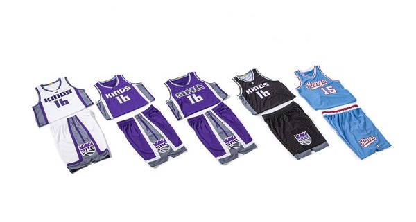
The Kings featured five new jerseys on their team Twitter account Wednesday for the upcoming season.
[tweet https://twitter.com/darrenrovell/status/743126960583233536]
They will have a white home uniform with gray and purple trim and Kings embroidered on their chest. They will also have a purple roady uni outlined in gray and white and a special “City” purple road uniform with gray numbers and names instead of white and “SAC” across the chest.
Here is Willie Cauley-Stein showing off all four of their normal uniform in a cool 360 degree video:
[tweet https://twitter.com/SacramentoKings/status/743140870074077184]
These are pretty snazzy jerseys in my opinion and mesh the purples, whites, grays and blacks perfectly. The new logo looks great on the shorts and below the collar.
Here are my favorites, the really sleek black alternate with a very cool and subtle crown design through the jersey…
[tweet https://twitter.com/SacramentoKings/status/743152354367836160]
And the return of the absolutely beautiful 1980s baby blue and red Kansas City uniforms…
https://twitter.com/SacramentoKings/status/743158984539013120
The Kings will look great on the court in 2016-17, one can only hope that they will actually play great for the first time in a decade.


