September 10, 2012 – The Hoop Doctors
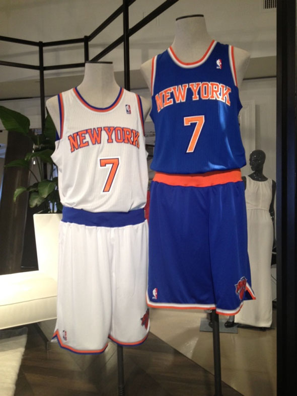
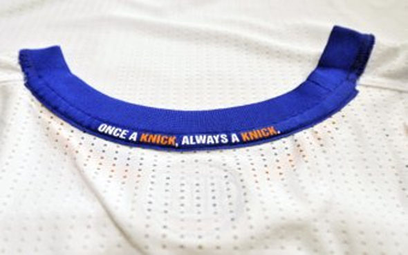
Not a massive wholesale change or anything, but the Knicks have tweaked the font on their jerseys and slightly changed the lines in the style. The changes are very subtle, but the design elements certainly are preferably to the over the top designs we have seen over the past few years. In some ways the Knicks may be trying to tweak the look to compete with the New Jersey Nets simple approach to their logo and jerseys. Speaking of which, it may even explain the words stitched into the neckline interior (image after the jump).


